Posts

Final Touches

Image
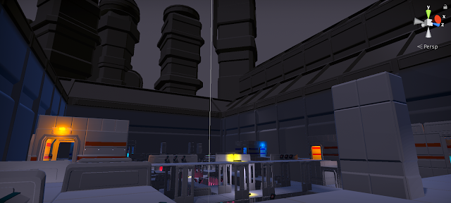
Not much noteworthy the final week of in-game working. It mostly came down to final lighting polishes, checks, and inclusion of some last minute polish assets. The polish assets of note were some spike assets, on which to impale robots, and some arches that add some flavor to the floodlights. The cool thing about these assets, however, is that they were capable of being used in two places- once in their original sizes for their original purpose, and again in the background, upscaled to appear as buildings. In this way, variety was added both in the small scale and the large scale.

Maximum Efficiency

Image
This week, I faced head on the issues of asset inefficiency in our maps- We were using 40 thousand assets for a scene that could be done in less than 10 thousand. This was mostly accomplished by simply fixing and remaking some prefabs, so that areas that once used 3 tile pieces now only used one. This was an easy process for the main arena map- not so for the lobby area, which due to a busted prefab had to be changed manually. While I was there, I finished updating the materials and colors on the lobby as well. I think it looks miles better now. I also used new meshes to update the look of the towers, to pull back the overly modular look, and added actual assets for the floodlights illuminating the space. Finally, I worked on the 1V1 level. These changes consisted of similar efficiency updates, replacing meshes where I could. I finally did a final props pass, fixed the stadium lighting, and did one final lighting pass to make sure it was looking good.

Back from the Trials

Image
After a long break, including a trip to Jordan and San Francisco, I return to work on re[Mod]. This week, there were several tasks- adjusting lighting and getting a rudimentary crowd animation was just the start. I pushed further in the campaign to present more games as easter eggs in the environment- seen here are Sojourn and Aurora references. Other assets of note were replacements for the health kits, both the large and small variants. Finally, the biggest task of all was the first pass lighting on our new 1V1 arena style map. This map is much smaller and has, in my opinion, much more opportunities for interesting lighting and props. Seen here is an example of the map part way through my lighting, props and decal pass.

And Then There Was Light...

Image
This week I added final implementation of the background assets mentioned last week. Bleachers, crowds, buildings, signs, and giant, spinning grinders of death are all present in the new build. Beyond that, Another major lighting pass has really helped the level come to life this week.

A Map to an Arena

Image
One of the biggest changes of the past week in the art department is definitely the transition the map has made. Gone are the days of free floating platforms- Now the map is properly set in an arena environment, complete with the beginnings of bleachers and distant buildings.

A Lighting Pass

Image
This week saw lots of new props and decorative assets, but the biggest jump was the light tests, which show new opportunities for making our environments look better than ever.

Assets

Image
This week was just more asset push. In addition to multiple variations on the original wall pieces, to allow diversity of architecture, I also began work on a number of tertiary props that can be scattered around the scene for more visual interest. At the moment I'm not even sure how prevalent these will be- the current level is very tight with not much room for maneuverability, but it's better to have them even if they're used sparingly. I also began using the trim sheet made by Tyler last semester, so future assets will have a bit more pop to them even if they have yet to be textured.