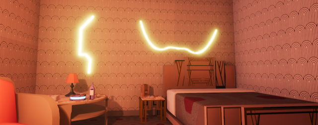
This week saw lots of new props and decorative assets, but the biggest jump was the light tests, which show new opportunities for making our environments look better than ever.
Welcome! This is the start of Michael Manfredi's Capstone Development Blog, where you can get a closer look at the artistic progress occurring on the Phantasm Team. This week, the main priority was about finding a simple style that lent was appealing to the eye but had a speedy workflow. I wanted to emulate the intense colors present in images like these, by Dominik Mayer and Halil Ural, respectively: They provide striking color and contrast. I did some experimentation with color clashing in these brief thumbnails. Finally, I did some tests in Unreal to see if the style could be emulated in engine, and I think despite no post processing edits and basic building block objects, the results were quite successful. After these experiments, I think we can utilize this style effectively by having semi detailed modeling and simple, color focused textures.
This week, aside from the standard prop and architecture asset creation, my main task was to bolster our collection of 2D assets. More specifically, we needed more variety of materials for the floors, walls and doors, and we needed decal assets for the mask design upgrades. I started with the mask decals. A problem we faced was two fold: We needed assets that the player could discover in the world that would unlock the certain upgrades they could then purchase. Each upgrade is represented by a design pattern on the player's mask, and therefore had to be visually distinct and line up with one another properly when overlaid. They also needed to be a decal we could place in the world so the player actually had something they were finding. I ended up taking the mask design, and dividing it up into 27 different individual image alphas, each going to its own decal that could be used for both the menu, the mask and the in-game collectable. The other task for the week was the ma...


Comments
Post a Comment