Posts

And Then There Was Light...

Image
This week I added final implementation of the background assets mentioned last week. Bleachers, crowds, buildings, signs, and giant, spinning grinders of death are all present in the new build. Beyond that, Another major lighting pass has really helped the level come to life this week.

A Map to an Arena

Image
One of the biggest changes of the past week in the art department is definitely the transition the map has made. Gone are the days of free floating platforms- Now the map is properly set in an arena environment, complete with the beginnings of bleachers and distant buildings.

A Lighting Pass

Image
This week saw lots of new props and decorative assets, but the biggest jump was the light tests, which show new opportunities for making our environments look better than ever.

Assets

Image
This week was just more asset push. In addition to multiple variations on the original wall pieces, to allow diversity of architecture, I also began work on a number of tertiary props that can be scattered around the scene for more visual interest. At the moment I'm not even sure how prevalent these will be- the current level is very tight with not much room for maneuverability, but it's better to have them even if they're used sparingly. I also began using the trim sheet made by Tyler last semester, so future assets will have a bit more pop to them even if they have yet to be textured.

The Kit is Started

Image
This week, the aim was to get started on a kit of modular architectural pieces. This would allow designers to begin construction of the map with pieces the thad some sense of finality. The focus was on the pieces that would be the most universally applicable- walls, doorways and floors/ceilings. Here's a brief selection of the pieces done so far.

Reinventing the Wheel

Image
This week continued the trend of finding new ways to represent the world of re[Mod]. I did a plethora of additional mood paintings and sketches, to help flesh out possible unique areas within the multiplayer map to help break up repetition of areas. Following the painter-over of a greybox test of the new map delivered by a designer, I analyzed the geometry to determine a rough estimate of what kinds of assets we would need to complete the basic structure of the environment. One final addition to our repertoire of inspiration was a poster for the show I created using some extra time. I felt it was important to get a feel for the "culture" of this game show. Io thought it would be amusing to contrast the gratuity of the of the shows content with a highly marketable set of characters to bring in crowds.

A New Team

Image
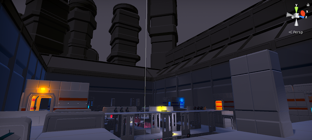
This week was the start of my environment work for re[Mod]. Because the environment needs to be completely redone, Tyler, the returning artist from last semester, has given me complete creative freedom on the new environment. My first priority was to find a new mood for the world- at present, it just feels boring. It's much too bright, with little lighting or design interest. I assembled a mood board that would help inspire a new style, with a slightly darker and more dynamic feel. I put a special focus on interesting color combinations, and "arena" type environments to provide inspiration appropriate to the context of our game. The next step is to find ways to incorporate these ideas into our game- I started this with a paint-over of our current map in a more visually interesting style.