Posts

Final Touches

Image
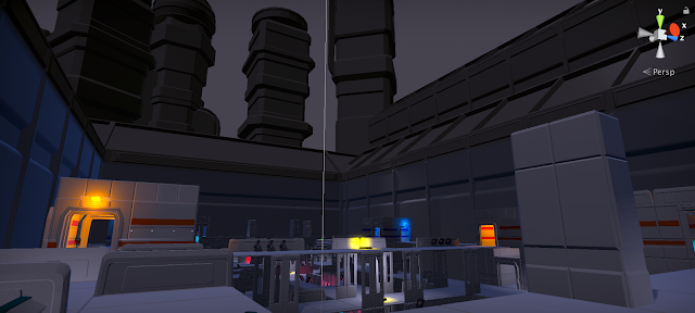
Not much noteworthy the final week of in-game working. It mostly came down to final lighting polishes, checks, and inclusion of some last minute polish assets. The polish assets of note were some spike assets, on which to impale robots, and some arches that add some flavor to the floodlights. The cool thing about these assets, however, is that they were capable of being used in two places- once in their original sizes for their original purpose, and again in the background, upscaled to appear as buildings. In this way, variety was added both in the small scale and the large scale.

Maximum Efficiency

Image
This week, I faced head on the issues of asset inefficiency in our maps- We were using 40 thousand assets for a scene that could be done in less than 10 thousand. This was mostly accomplished by simply fixing and remaking some prefabs, so that areas that once used 3 tile pieces now only used one. This was an easy process for the main arena map- not so for the lobby area, which due to a busted prefab had to be changed manually. While I was there, I finished updating the materials and colors on the lobby as well. I think it looks miles better now. I also used new meshes to update the look of the towers, to pull back the overly modular look, and added actual assets for the floodlights illuminating the space. Finally, I worked on the 1V1 level. These changes consisted of similar efficiency updates, replacing meshes where I could. I finally did a final props pass, fixed the stadium lighting, and did one final lighting pass to make sure it was looking good.

Back from the Trials

Image
After a long break, including a trip to Jordan and San Francisco, I return to work on re[Mod]. This week, there were several tasks- adjusting lighting and getting a rudimentary crowd animation was just the start. I pushed further in the campaign to present more games as easter eggs in the environment- seen here are Sojourn and Aurora references. Other assets of note were replacements for the health kits, both the large and small variants. Finally, the biggest task of all was the first pass lighting on our new 1V1 arena style map. This map is much smaller and has, in my opinion, much more opportunities for interesting lighting and props. Seen here is an example of the map part way through my lighting, props and decal pass.

And Then There Was Light...

Image
This week I added final implementation of the background assets mentioned last week. Bleachers, crowds, buildings, signs, and giant, spinning grinders of death are all present in the new build. Beyond that, Another major lighting pass has really helped the level come to life this week.

A Map to an Arena

Image
One of the biggest changes of the past week in the art department is definitely the transition the map has made. Gone are the days of free floating platforms- Now the map is properly set in an arena environment, complete with the beginnings of bleachers and distant buildings.

A Lighting Pass

Image
This week saw lots of new props and decorative assets, but the biggest jump was the light tests, which show new opportunities for making our environments look better than ever.

Assets

Image
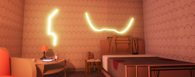
This week was just more asset push. In addition to multiple variations on the original wall pieces, to allow diversity of architecture, I also began work on a number of tertiary props that can be scattered around the scene for more visual interest. At the moment I'm not even sure how prevalent these will be- the current level is very tight with not much room for maneuverability, but it's better to have them even if they're used sparingly. I also began using the trim sheet made by Tyler last semester, so future assets will have a bit more pop to them even if they have yet to be textured.

The Kit is Started

Image
This week, the aim was to get started on a kit of modular architectural pieces. This would allow designers to begin construction of the map with pieces the thad some sense of finality. The focus was on the pieces that would be the most universally applicable- walls, doorways and floors/ceilings. Here's a brief selection of the pieces done so far.

Reinventing the Wheel

Image
This week continued the trend of finding new ways to represent the world of re[Mod]. I did a plethora of additional mood paintings and sketches, to help flesh out possible unique areas within the multiplayer map to help break up repetition of areas. Following the painter-over of a greybox test of the new map delivered by a designer, I analyzed the geometry to determine a rough estimate of what kinds of assets we would need to complete the basic structure of the environment. One final addition to our repertoire of inspiration was a poster for the show I created using some extra time. I felt it was important to get a feel for the "culture" of this game show. Io thought it would be amusing to contrast the gratuity of the of the shows content with a highly marketable set of characters to bring in crowds.

A New Team

Image
This week was the start of my environment work for re[Mod]. Because the environment needs to be completely redone, Tyler, the returning artist from last semester, has given me complete creative freedom on the new environment. My first priority was to find a new mood for the world- at present, it just feels boring. It's much too bright, with little lighting or design interest. I assembled a mood board that would help inspire a new style, with a slightly darker and more dynamic feel. I put a special focus on interesting color combinations, and "arena" type environments to provide inspiration appropriate to the context of our game. The next step is to find ways to incorporate these ideas into our game- I started this with a paint-over of our current map in a more visually interesting style.  

Postmortem

As I float towards Re[Mod], I think back on our attempted game, Empirical, and wonder what could have been. It certainly was a high-scope project- essentially the scale of a single level from Bioshock- and we got closer than I could have imagined to achieving the goal. I can't really speak on the challenges Amos and Kai, the designers faced. Nor can I touch the programming difficulties. My understanding and specialty lies solely within the realm of the art, and the Environment. In that regard, I am quite proud of the end result.  Early in the process, the main objective of figuring out exactly how such a large area could be modeled, constructed and polished by one person, was quite the mystery. Thanks to a well crafted pipeline I think not only did we manage to build a believable space, I also think we created a place that has a sense of genuine atmospheric dread.  I would have loved to have an animator, of course, as the enemies are quite... stiff. But I think the ...

The Second Dimension

Image
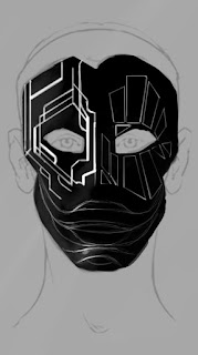
This week, aside from the standard prop and architecture asset creation, my main task was to bolster our collection of 2D assets. More specifically, we needed more variety of materials for the floors, walls and doors, and we needed decal assets for the mask design upgrades. I started with the mask decals. A problem we faced was two fold: We needed assets that the player could discover in the world that would unlock the certain upgrades they could then purchase. Each upgrade is represented by a design pattern on the player's mask, and therefore had to be visually distinct and line up with one another properly when overlaid. They also needed to be a decal we could place in the world so the player actually had something they were finding. I ended up taking the mask design, and dividing it up into 27 different individual image alphas, each going to its own decal that could be used for both the menu, the mask and the in-game collectable. The other task for the week was the ma...

Asset Crank

Image
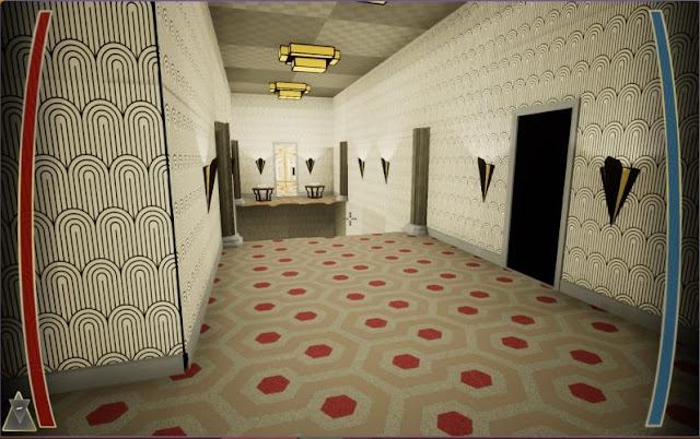
This week, a number of tasks lay before me.  -Create assets for the Heads Up Display... -Create a final character asset that the enemy shader could be applied to... -Make some flashy art for our next presentation... -And finally, spend whatever remaining time I had making new assets that would work in various settings such as lounges, halls and lobbies- and then using said assets to polish existing levels. Fortunately, the HUD and character took significantly less time than it could have. The general layout of the health, energy and corner spaces (which can hold  numbers for collectables or other information) are meant to be as out-of-the-way as possible, complemented by the vignette effect on either side of the screen. The vignetting also helps suggest the player is indeed wearing the mask, which is a pivotal part of the narrative, and helps make the game feel a bit more claustrophobic and cramped. Much inspiration for the overall shape was taken from...

Masks!

Image
This week, I was tasked with prioritizing the creation of the mask- the source of the player's abilities in the game. The two major parts of that were making the actual mesh and base material (which as an environment artist proved an interesting challenge), and developing a design scheme and layout for the designs of the mask. Begins the designs are a representation of the player's upgrades, they must exist as a separate entity from the mask material itself so they can be progressively added on during gameplay. For now, I just had to finalize the designs themselves. This was the task I started with- finalizing the mask shape and creating the designs. After a good deal shape meddling, I ended with a shape and set of designs I really liked. Because of the three upgrade category, three distinct design languages needed to be present in separate areas of the mask so that players can easily differentiate one type of upgrade from another. All in some come were inspired by Ar...